
To carry on from my previous blog post that pertained to the font of your Power Points, I wanted to cover one more topic I felt was crucial to a successful presentation. Animations, it’s used 90% of the time in Power Points, and usually it’s not used effectively or correctly. I think my experience with animations hasn’t always been that great, and I’ve walked away with the motto that “just because it’s there doesn’t mean you have to use it.” Animations come in two different flavors, the animations that are embedded into each slide and pertain to the headings, bullets, and graphics; and the animations that take you from slide to slide (aka Transitions). Both are forms of animations for all intents and purpose and are subject to correct application within your Power Point where necessity dictates.
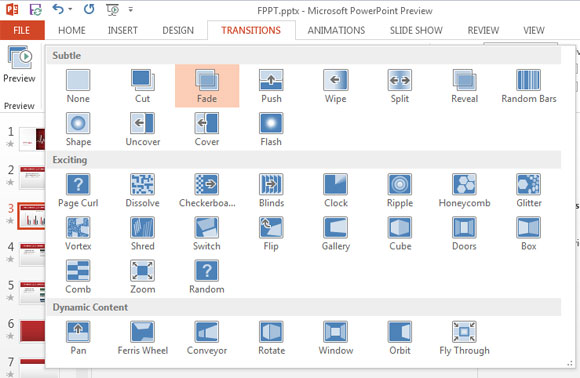
First, let’s cover the transitions from slide to slide within your Power Point. Lesson number one is to try not to use too many transitions and within those transitions try not to use too many different types. The main killer to a good, professional looking Power Point is one that has an overabundance of transitions in the Power Point, and each transition is different from the last. It looks sloppy and unprofessional. You should spend a little time going through the transitions and pick one, maybe two, which seem to fit the flow of your Power Point and use them sparingly throughout your presentation. As I said earlier, just because they are there doesn’t mean you should be using all of them all the time!
The second aspect to animations pertains to the actions that can be applied to the headings, bullet points and graphics of your presentations. This is one of the most powerful features of Power Point, when used correctly, because it allows you to do so much with the information within your presentation. Again, it is essential to not go overboard with this feature; you do not want to do so much that you spend half of your presentation “clicking” through bullet points. On that same note, if you choose to use animations, you MUST make a few practice runs through your presentation so that you know when you need to advance through your information. If you don’t make practice runs, you are sure to be playing “click catch up”, that is you cover a ton of information for which you forgot to bring on the screen for the audience to follow along with.
Most notably, the use of animations is used in conjunction with bullet points and graphics. When you combine your bullet points with animations you stop the reader from going into further information before you want them to, it allows you to drive home each point or piece of information before moving onto the next and helps keep the audience engaged and NOT lost with what you are discussing. When using animations with graphics, it’s an extremely poor choice to use them on generic clip art that is only there to add color to your presentation.

Use the animations when you want your graph, or diagram to come alive. If you wish to show that overwhelming amount (or underwhelming) of a pie chart use animation to bring in the individual slices. If you want to use a graphic to depict the before and after effects use animation to help drive home your point, once again the key is to be simple with it. As stated above, try to stick with only one or two animations and only use them when needed, overkill is never a good thing in this area.
For more information, please refer to the following websites:
1) http://www.techrepublic.com/blog/five-apps/five-tips-for-creating-animations-in-powerpoint-2010/316
2) http://www.ehow.com/way_5406363_powerpoint-animation-tips.html
3) http://techtalk.pcpitstop.com/2012/03/13/powerpoint-tips-cool-transitions-connect-slides/
